Om SynligWeb
Et Webbureau Bygget på
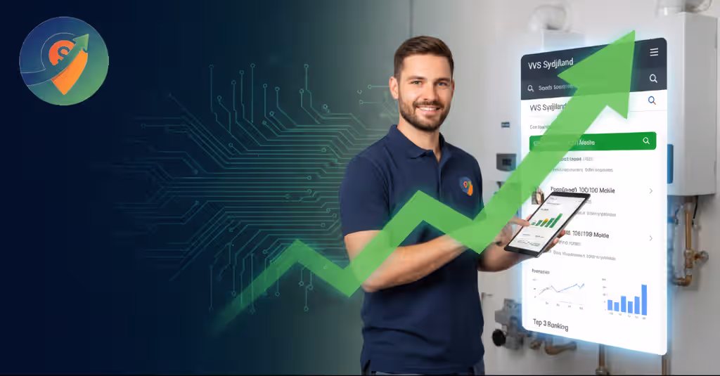
Performance & Resultater
WordPress · Statisk HTML · SEO · GEO · AEO
Vi startede SynligWeb med ét mål: at bygge hjemmesider der faktisk virker. Ikke langsomme skabeloner. Ikke bureaufloskler. Kun gennemtænkt strategi, konverteringsoptimering og hastighed i absolut topklasse.
✓ 100% gennemsigtighed
✓ Ingen bindinger
✓ Du ejer det hele